Social Alert
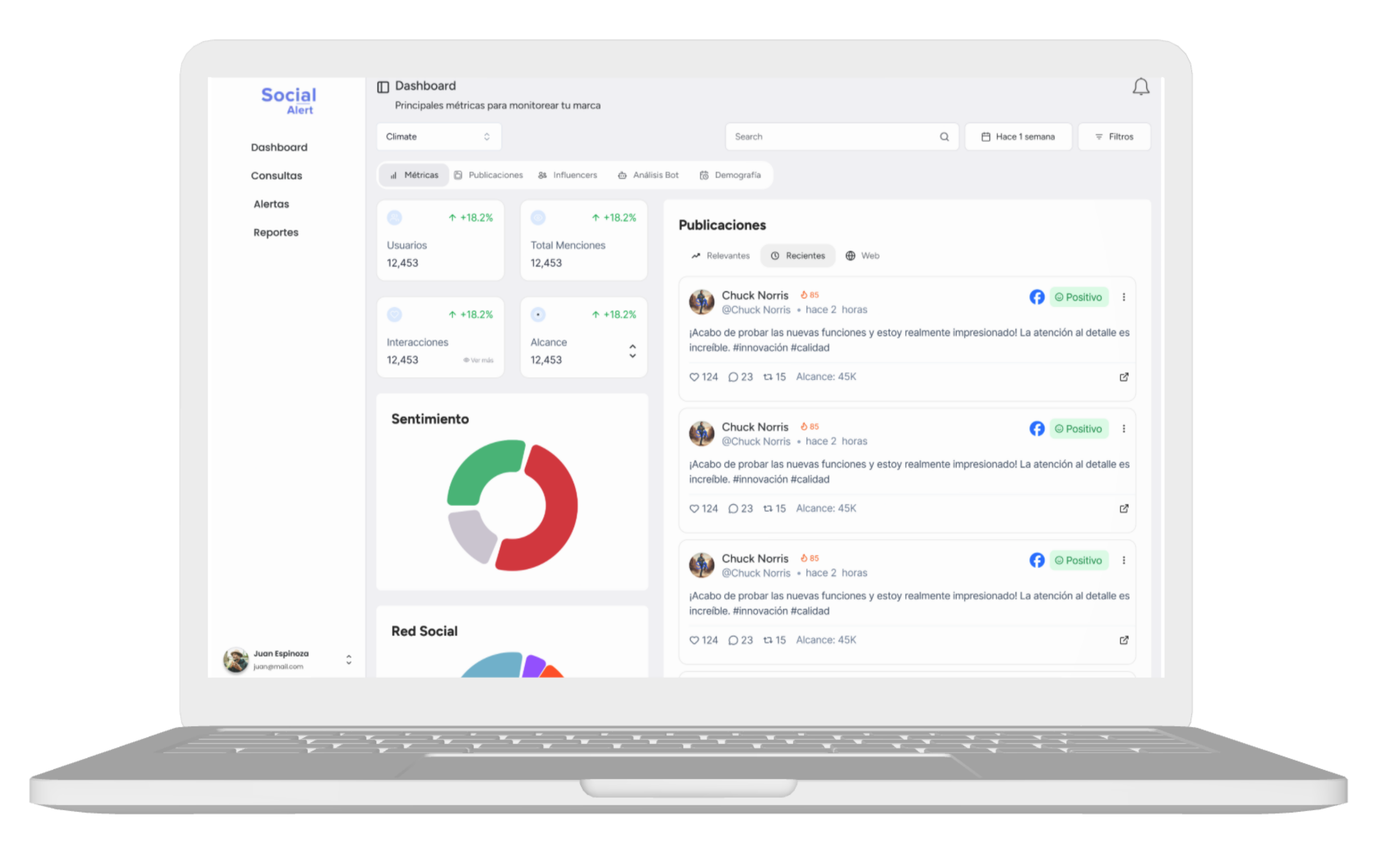
Social Alert is a social media listening and monitoring tool for crisis management and early warning. It identifies negative or positive comments, words, and patterns to prevent crises or act in time.
The project requires a complete redesign of the web application to align with new business objectives.
Role
Lead UI/UX Designer
Research, design, testing
Team
5 people
1 designer, 3 Developers, 1 PM
Duration
3 months
July - September 2025
On this page:
The Social Alert Platform presented various usability issues that directly affected user experience and product efficiency.
- Lengthy and unintuitive flows.
- Users couldn't clearly find where information was located.
- Excessive cognitive load.
- Visually outdated interface.
- Limited agility and reliability of the platform for users.
- Lack of clarity in information hierarchy.
- Competition from more modern and efficient tools.
These issues negatively impacted user satisfaction and the platform's effective value.
UX Objectives
- Improve overall usability of the proposed flow.
- Reduce errors and friction points.
- Design a consistent experience across web and mobile.
Business Objectives
- Increase product sales.
Expand platform usage.
To better understand users and the product context, the following activities were conducted:
- Benchmark of similar platforms.
- Surveys of active users.
- User navigation research using tools like Clarity and Posthog
- Heuristic analysis of the platform.
User surveys
Both active users and the internal team were surveyed. The information gathered from this process was as follows:
| Friction points | Main findings | Recurring evidence | Opportunities for improvement |
|---|---|---|---|
| Query structuring | High difficulty using AND / OR and exclusions | Main source of errors and tickets | Visual logic editor, clear examples, and validations |
| Confidence in results | Medium or low confidence; users manually review results | Confusing words and noise in results | Preview of results before saving |
| Creation flow | Functional but long, repetitive process with excessive scrolling | Redundant blocks and unclear steps | Flow simplification and step grouping |
| Query complexity | Construction of long and complex queries | Tedious to add and edit terms | Version saving and quick editing |
| Visual interface | Usable but unclear and outdated | Small typography and low contrast | Improvement of visual hierarchy and readability |
| Use of filters and options | Many options exist but are rarely used | Complex and unintuitive filters | Simplify options or show contextual help |
| Alert settings | Alerts decoupled from main flow | Generates user confusion | Integrate alerts directly into the creation flow |
| Tickets and support | Most tickets come from query creation | Users don't see data due to misconfiguration | Guided design to reduce tickets |
| Expected automation | High expectation for automated assistance | Natural language, suggestions, preview | AI-assisted queries |
Benchmark of similar platforms
The following platforms that perform social media monitoring or listening were analyzed to discover improvement opportunities and differentiators
| Platform | Key Features | Strengths | Weaknesses |
|---|---|---|---|
 Brand24 Brand24 | • Real-time mention monitoring • Basic alerts • Sentiment analysis • Simple reports | • Easy to use • Quick setup • Ideal for SMEs and non-technical users | • Limited capabilities for complex queries • Little advanced customization • Less in-depth analysis |
 Brandwatch Brandwatch | • Advanced social listening analysis • Complex queries • High volume of sources • Customizable dashboards | • Very powerful for deep analysis • High query flexibility • Scalable for large enterprises | • High learning curve • Complex interface for new users • High cost |
 Sprout Social Sprout Social | • Social media management, monitoring, publishing • Integrated analytics • Collaborative workflows | • Excellent UX • Clear interface • Well-structured reporting | • Shallower social listening • Little flexibility in advanced search logic |
 Hootsuite Hootsuite | • Social media management and scheduling • Basic monitoring • Multiple integrations | • Easy adoption • Good multi-channel management • Well-known in the market | • Limited deep analysis capabilities • Simple queries • Fragmented experience in advanced flows |
Heuristic analysis
A heuristic analysis of the platform was conducted to identify certain usability issues.
| Heuristics | Description | Question 1 | Score 1 | Question 2 | Score 2 | Question 3 | Score 3 | Average |
|---|---|---|---|---|---|---|---|---|
| Visibility of system status | Users must always know what is happening in the interface. | Does the interface show a loading or progress indicator when something is being processed? | 3 | Does the user receive a visual confirmation or message when an action is completed successfully? | 3 | Are errors or problems that occur in the system clearly highlighted? | 3 | 3 |
| Match between system and the real world | The interface should speak the same language as the users, using familiar terms. | Are the terms and labels used in the app understandable for the average user? | 3 | Do the icons and visual elements represent objects or actions that users already know? | 3 | Does the navigation flow follow a natural logic, as in real-world experiences? | 2 | 2.67 |
| User control and freedom | Users must be able to correct errors and navigate freely. | Can important actions (like deleting a file) be undone? | 4 | Can users cancel a process at any time if they change their mind? | 4 | Is there an option to go back or return to a previous state? | 4 | 4 |
| Consistency and standards | The interface must be predictable and follow recognized standards. | Do buttons, menus, and actions work and look the same across all sections of the app? | 3 | Do colors and symbols have the same meaning throughout the app? | 2 | Do interactive elements (buttons, links, icons) have predictable behavior? | 4 | 3 |
| Error prevention | It is better to prevent errors than to fix them later. | Does the system prevent the user from submitting incomplete forms or incorrect data? | 4 | Is confirmation requested before irreversible actions, such as deleting an account or file? | 5 | Does the system prevent destructive actions without confirmation, like closing a tab without saving? | 3 | 4 |
| Recognition rather than recall | It is easier to recognize something than to remember it. | Are the names of the buttons and menus clear and easy to understand without guessing their function? | 3 | Can the user see available options and actions without having to remember where they are? | 3 | Are there hints, tooltips, or visual examples to help the user complete tasks effortlessly? | 2 | 2.67 |
| Flexibility and efficiency of use | A good interface adapts to both beginners and experts. | Are there keyboard shortcuts or quick accesses for frequent or advanced users? | 3 | Can the user customize options to adapt the experience to their needs? | 2 | Does the system offer smart suggestions or automation to speed up repetitive tasks? | 0 | 1.67 |
| Aesthetic and minimalist design | Less is more: avoid unnecessary elements in the interface. | Does the interface avoid excessive text or unnecessary visual elements? | 1 | Do the colors, typography, and visual elements follow a clear hierarchy to highlight the most important info? | 2 | Do colors and images help to understand the information? | 3 | 2 |
| Help users recognize, diagnose, and recover from errors | When users make mistakes, the interface should help them correct them. | Do error messages clearly explain what happened and how to fix it? | 3 | Can errors be corrected without losing data or restarting the process from scratch? | 3 | Does the system suggest solutions or links to help when a problem occurs? | 1 | 2.33 |
| Help and documentation | There should be accessible help and documentation when the user needs it. | Is there a help section or FAQs accessible in the interface? | 2 | Are the instructions and guides well organized and easy to understand? | 1 | Can the user search for solutions within the app without leaving to another site? | 2 | 1.67 |
| Final Average | 2.7 | |||||||
UI
The following usability issues were identified on the platform:
Query creation

Main dashboard

Alert settings

Heat maps
It was proposed to integrate user tracking tools like Clarity and Posthog to better understand user behavior on the platform and thus identify usability issues, heat maps, where they spend more time, etc.
Heat map - Query creation
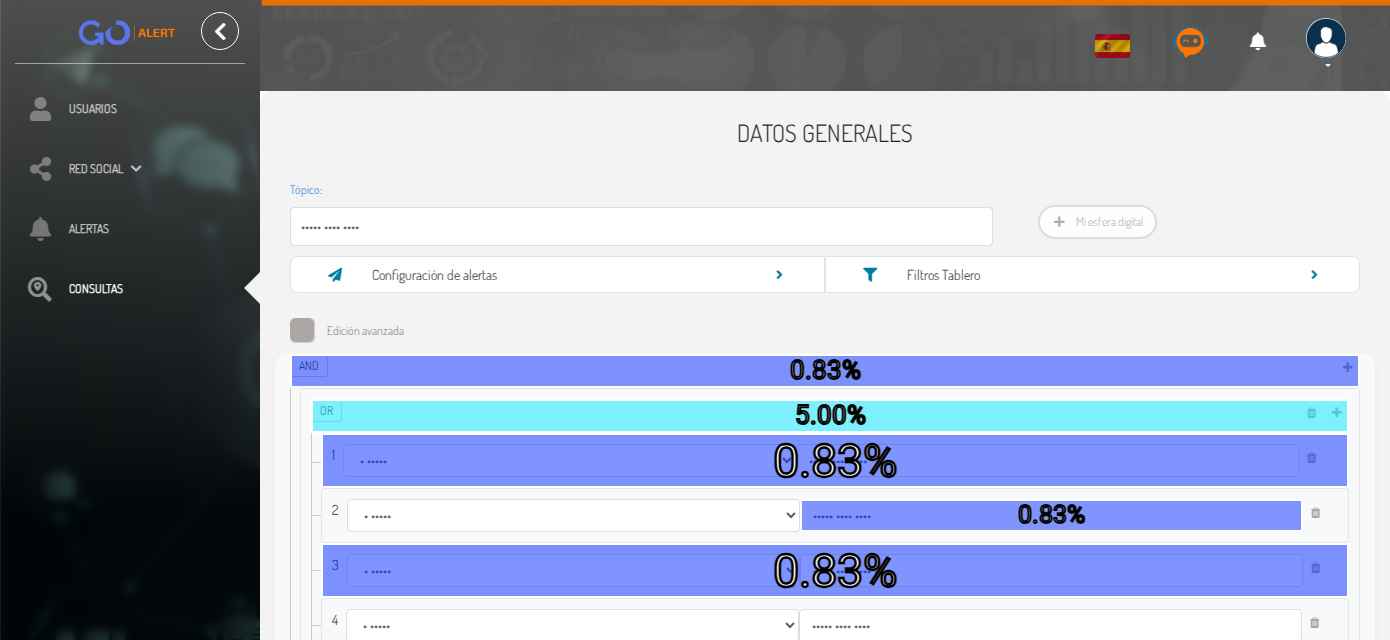
The data shows that users spend a lot of time on query creation, indicating that they have trouble creating queries.
Heat map - Main dashboard
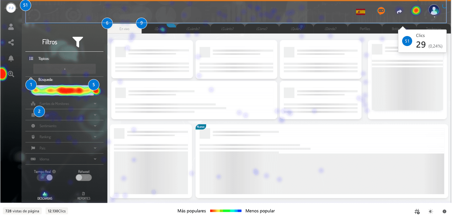
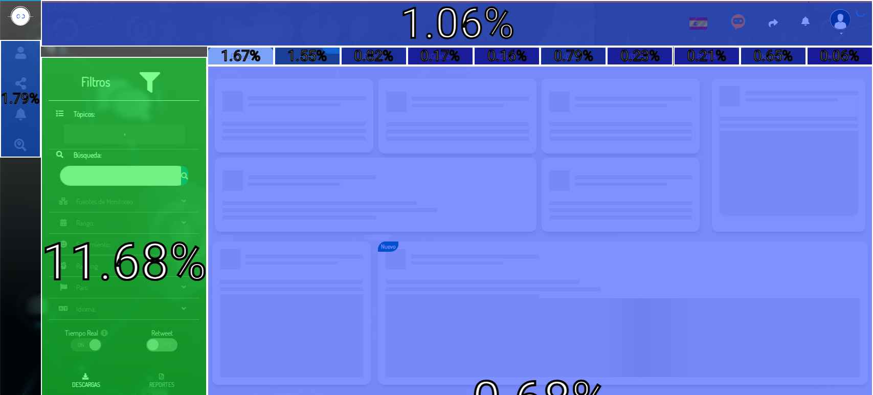
Here it is observed that users frequently use the query search area, and the first (Live) and second tab (What) on the dashboard, while the other tabs are seldom or never used.
Insights found
With the information gathered from the surveys and benchmark, the following insights were identified:
Complex flows
Friction was found in important flows such as:
- Query creation.
- Alert configuration.
Focus: Simplify the most important flows.
Too much information
A lot of scattered and repeated information on the main dashboard, which made it difficult to read and understand the information.
Focus: Group and simplify the information.
Usability issues
There are usability issues on the platform that hinder the user experience.
Focus: Improve the platform's usability by correcting the points identified in the heuristic analysis.
We worked on improving the most important flows, such as the query creation, dashboard, and alerts flow.
Query creation
The query creation flow was redesigned to make it simpler and faster for the user. The flow was divided into 2 steps.
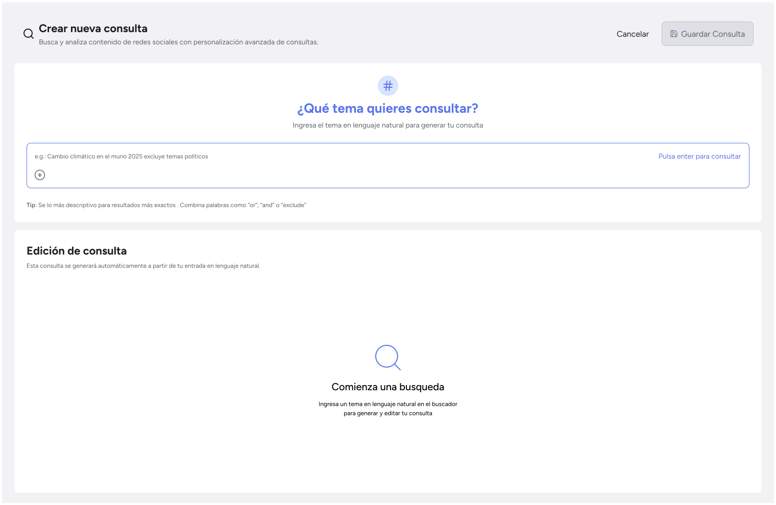
Natural language query input
To facilitate the query creation process, a query input was included so users can create queries in natural language and have them translated behind the scenes into complex queries (AND/OR).
Complexity of understanding AND/OR: By having a natural language query input, the user doesn't need to understand AND/OR, they only need to write what they want and the system takes care of translating it into complex queries.
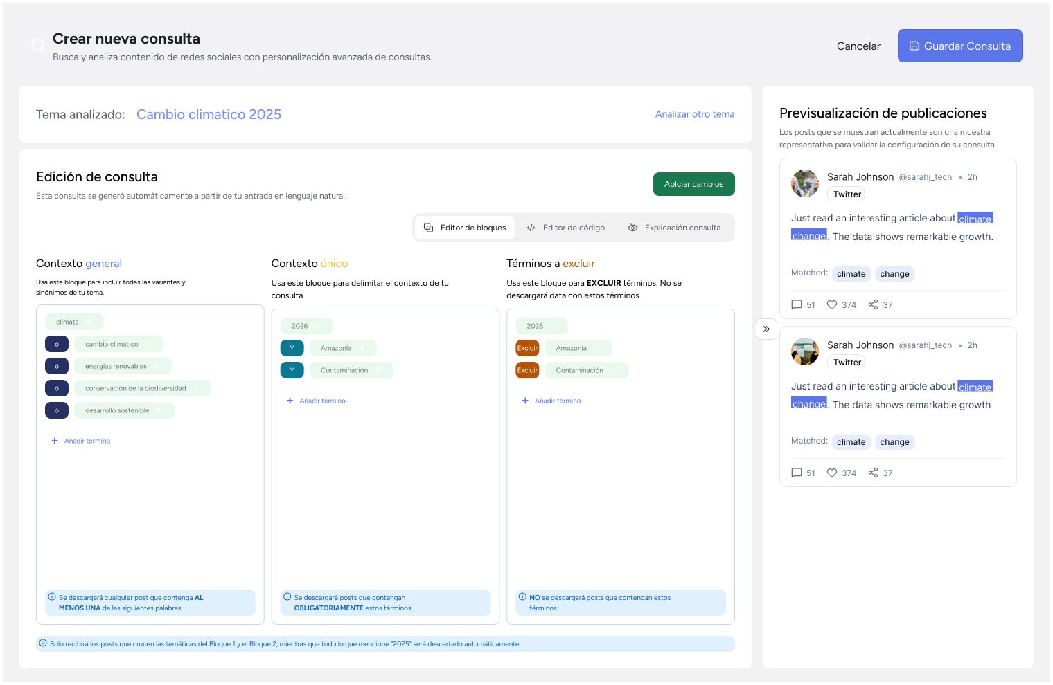
Built query visualization
In this section, the user can see the query that has been built in different formats and can edit it, add keywords, or remove keywords.
User-friendly block visualization (AND/OR) Taking into account the difficulties and problems users had with the previous query format, the query is displayed in different formats so users can better understand how it's being constructed.
Editing flexibility: Users can edit the query, add keywords, or remove keywords as needed on a single screen, eliminating the need to scroll.
Visual aids: Visual aids, hints, and tooltips were implemented so users can better understand how the query is being built, what each query block does, and how it relates to other parts.
Post preview:A small sample of posts found with the current query now appears, allowing users to see the query results in real time. If it matches what they're looking for, they can proceed to execute the full query.
Dashboard
For the dashboard, we chose to reduce the amount of unnecessary and repetitive information and display only relevant information, properly grouped for the user.
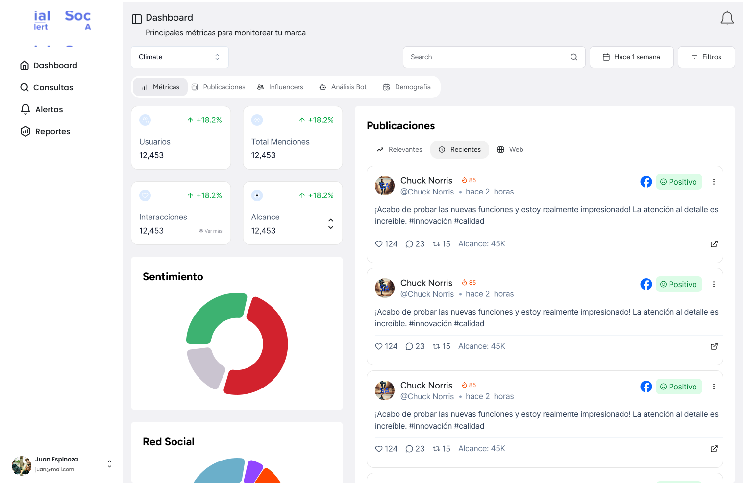
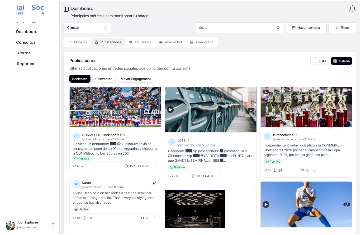
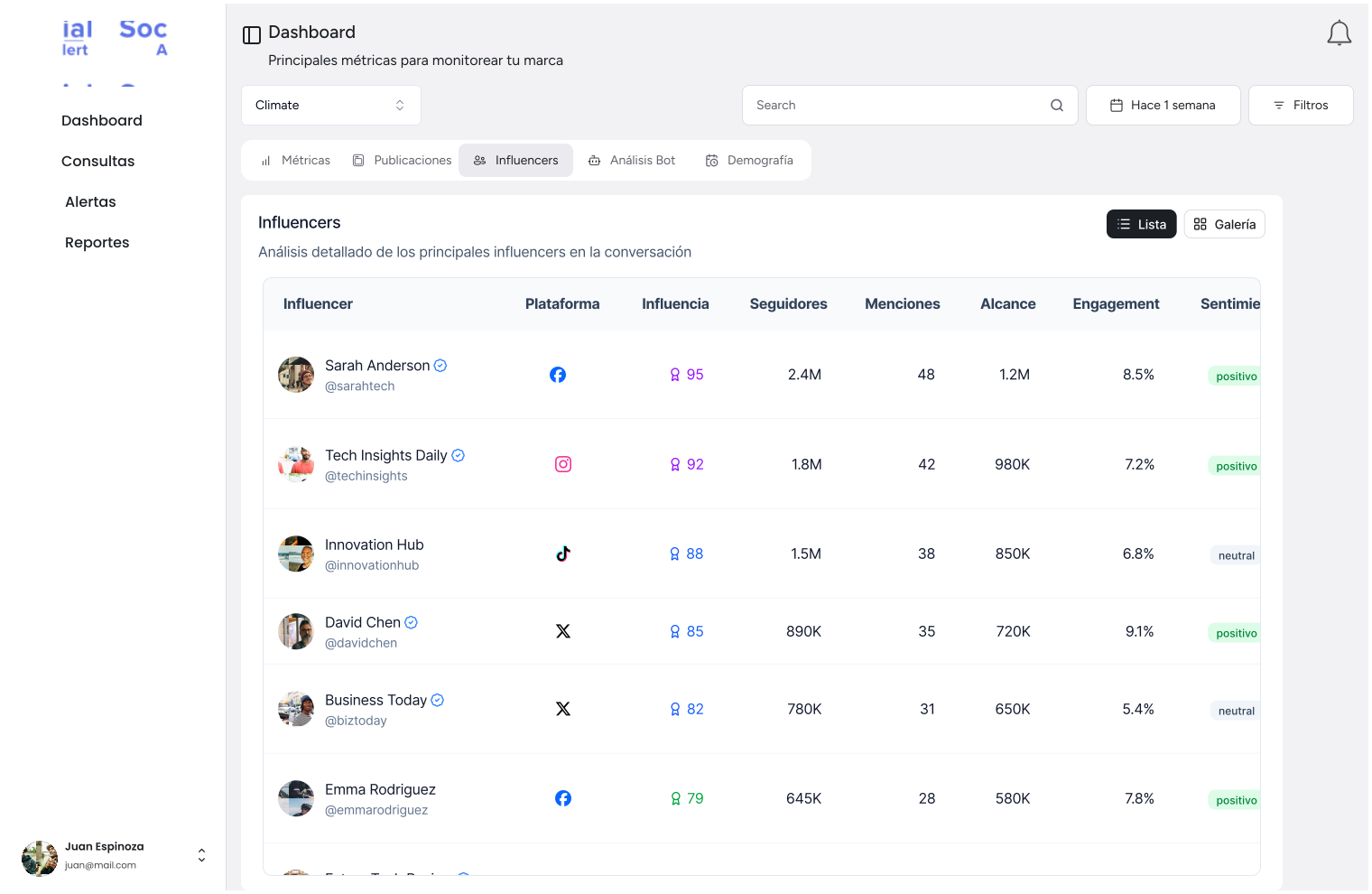
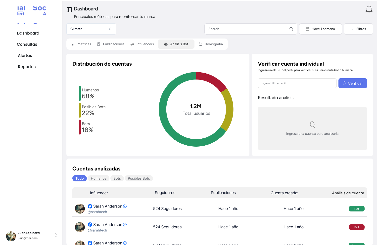
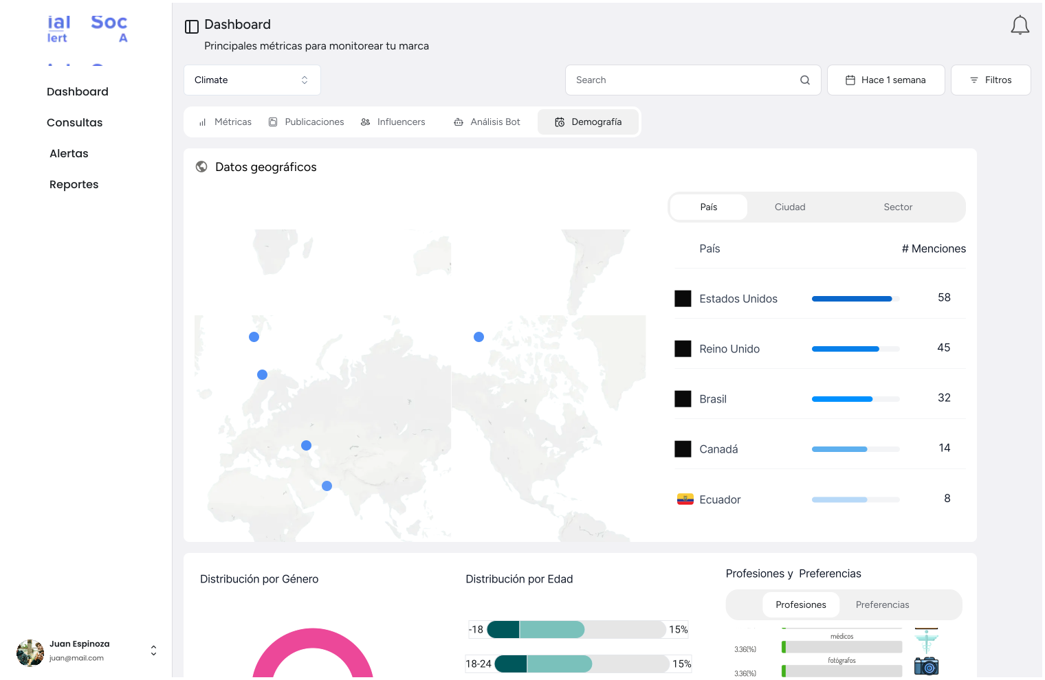
New dashboard
The dashboard was reorganized so users can view information clearly and in an orderly manner, with the most frequently used filters—based on collected metrics—positioned at the top for easy access.
Disorganized information:The previous dashboard displayed too much information, making it difficult for users to find what they needed. The number of tabs was reduced and information was reorganized more clearly.
Intuitive filters Based on observations and heat maps that reflected where users spent the most time, the most frequently used filters were positioned at the top for easy access.
Improved usability:The heuristic analysis identified several areas for improvement, which were implemented in the dashboard redesign. This included information hierarchy, component standardization, icons, minimalist design, etc.
Alert settings
The alert creation flow was separated from the query configuration section, allowing users to configure alerts independently without mixing the two processes.
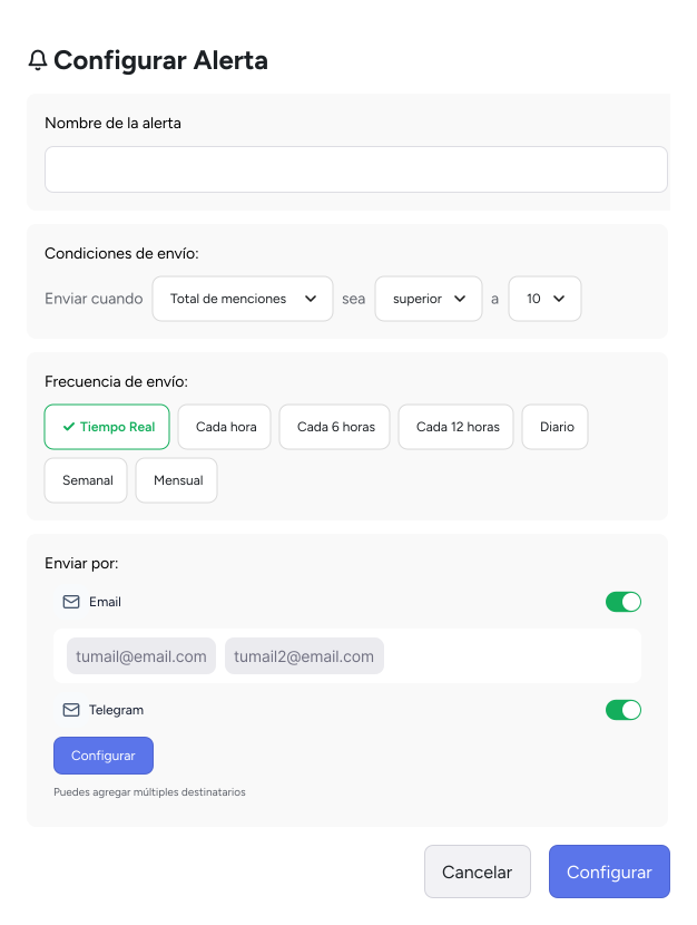
Alert settings
Separate flows:The alert creation flow was separated from the query configuration section, allowing users to configure alerts independently without mixing the two processes.
User-friendly configuration: The alert configuration form was redesigned to be more user-friendly and easier to use. Unnecessary fields were removed and tooltips were added to explain each field.
Improved user experience: Testing was conducted with internal users to validate the redesign of the alert configuration form. Positive feedback was received from users, who indicated that the form was more user-friendly and easier to use.
Before code implementation, validation sessions were conducted:
- A/B testing with internal users.
- Interactive prototype validation.
- Adjustments based on feedback prior to development.
- Use of testing tools (Maze).
The result was a new version of the product with:
- More tangible and clear interfaces.
- Shorter and more understandable flows.
- Consistent visual hierarchy.
- Consistent design aligned with a visual system.
- Improved user experience.
- Reduced cognitive load.
- Information organized, grouped, and hierarchized.
Replicate and adapt: Some platforms had already detected and corrected many of the errors that ours had, so we replicated those solutions, always adapting them to our own needs and objectives.
Functionality above all:Many design decisions were made based on information gathered from users and the team, since placing certain information in a specific location was essential to streamline their work and navigation on the platform
Involve all stakeholders:Involving all stakeholders at different stages is crucial to validate ideas and designs, both with stakeholders and with the development team, to maintain good communication and avoid problems during development.
More projects