Scan Audience
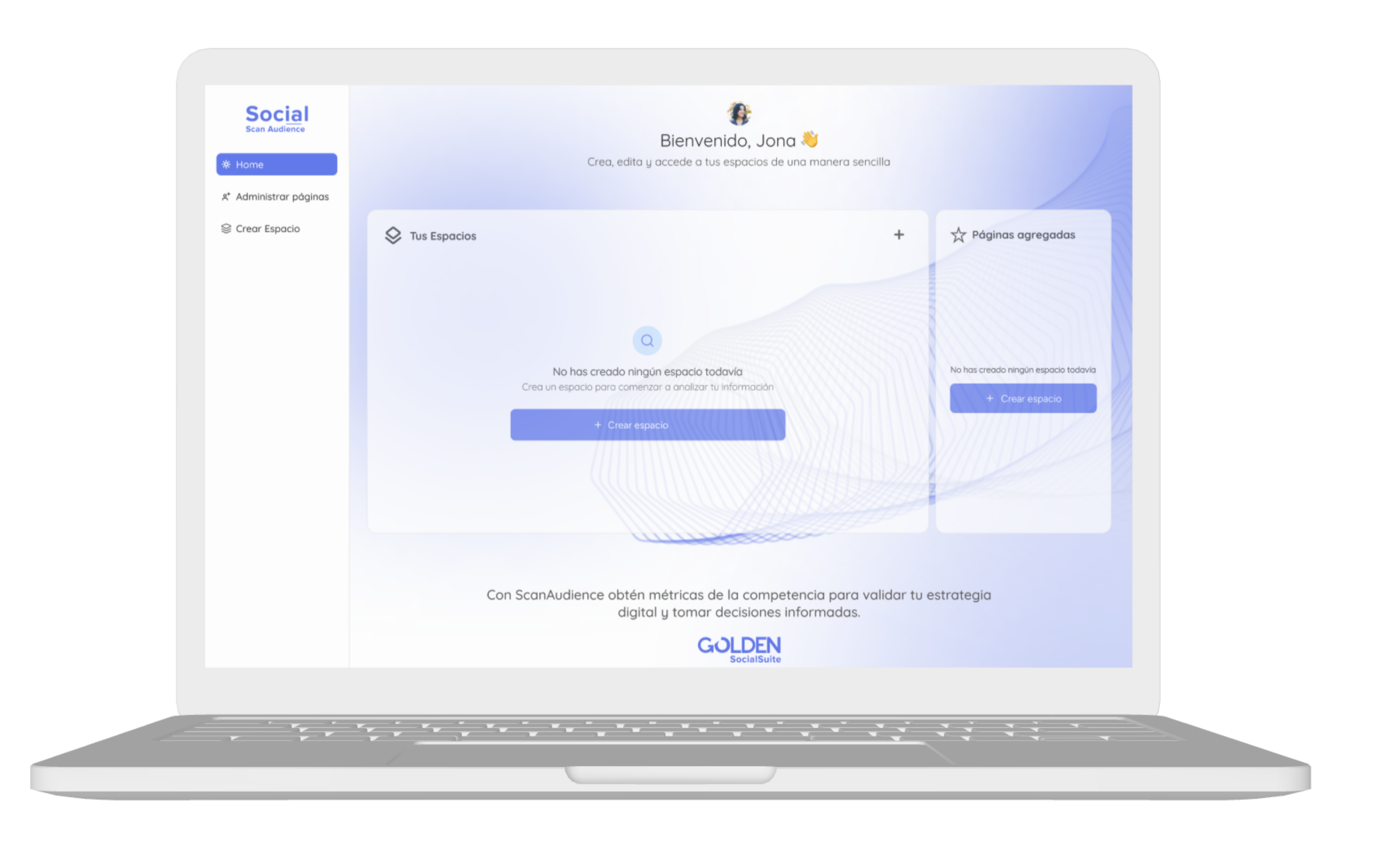
Scan Audience is an advanced tool designed to evaluate your brand's performance and make comparisons with other brands in the market.
The platform presented friction at important points, failing to clearly communicate the product's value or guide the user toward the main actions.
Role
Lead UI/UX Designer
Research, design, testing
Team
5 people
1 designer, 3 Developers, 1 PM
Duration
3 months
October 2025 - January 2026
On this page:
Problems
Based on internal feedback and usage observation, the following problems were identified:
- The login didn't clearly communicate the platform's purpose
- The Home didn't present useful information
- Users took time to identify the main action
- There was little visual hierarchy and cognitive overload
These factors affected the user experience and product adoption.
Objectives
UX Objectives
- Redesign main screens
- Reduce and group information
- Design a consistent experience
- Update overall UI
Business Objectives
- Attract new customers and increase brand awareness
Research
Light research was conducted, focused solely on the screens to be redesigned:
- Heuristic usability analysis
- Competitive analysis
- Surveys of active users
- User navigation research using tools like Clarity and Posthog
User Surveys
Sample: 50 participants · February 2026
User Profile
Overall Satisfaction
62%
Satisfied
28%
Neutral
Most Used Feature
Attribute Rating (scale 1–5)
● Critical Issue to Address
User Voice
“I love the depth of the data, but sometimes I get lost among so many tabs and information. There's too much information and I don't know where to start.”
“The information is very valuable, but the interface looks oversaturated with colors and disorganized. Hard to read.”
“I would like to be able to create my own reports with the information I need. Also download the reports in different formats, not just PDF.”
User Journey Map - Creating Spaces
Persona: Valeria Martínez · Social Media Manager
Scenario: Valeria needs to create a space to compare her brand's performance against 3 key competitors to present it at a strategy meeting in 20 minutes.
| 1. Discovery | 2. Create Space | 3. Add Pages | 4. Analysis | |
|---|---|---|---|---|
| Action | Enters the platform and looks for the "Spaces" section. | Must select from the pages she has entered, if there are none she must add pages. This redirects her to the "Pages" section, exiting the space creation process. | Adds the pages required for her analysis and returns to space creation. | Takes a first look at the analytics dashboard. |
| Thought | "I hope this is a quick and simple comparison." | "Why can't I add pages from space creation?" | "How should I enter the pages?" | "What information does this Dashboard provide me? How can I compare with competitors?" |
| Emotion | 🙂Neutral / Expectant | 🤨Confused | 😕Frustrated | 😨Overwhelmed |
| Pain Point | ⚠There is no clear flow for creating spaces. | ⚠It's not possible to add pages from space creation. You need to exit space creation to add pages. | ⚠Not intuitive how to add pages | ⚠The initial dashboard has too much information. |
Design Opportunities
Phase 1 · Discovery
How might we provide direct access to space creation?
Phase 2-3 Create Spaces / Add Pages
How might we simplify space creation and the add pages flow?
Phase 4 · Analysis
How might we synthesize the dashboard information and make it more intuitive?
User Journey Map — Comparison Flow
Persona: Jimmy Alvear · Data Analyst
Scenario: Jimmy needs to compare his brand's performance against a specific competitor in the last quarter.
| 1. Initial Navigation | 2. Configuration | 3. Execution | 4. Results | |
|---|---|---|---|---|
| t('accion') | Look for the "Comparison" option in the tabs. | Look for where to select the pages and the start and end dates. | Look for the "Apply" button to generate the comparison. | Analyze the generated comparison. |
| Thought | "There are so many tabs, where is the comparison?" | "How do I select the pages and the start and end dates? I can't find the date picker... Ah, it's hidden in this gray dropdown." | "Why aren't the changes being applied? Oh, I have to press the apply button." | "Finally... but I had to repeat the process twice for the second column." |
| Emotion | 🤨Neutral | 😫Overwhelmed | 🤯Lost | 😤Exhausted |
| Pain Point | ⚠Too much information: there are too many tabs on the dashboard | ⚠Poor accessibility: the page and date selectors look like plain text, not clickable fields. | ⚠No visual hierarchy: the "Apply" button competes with 5 other bright colors. | ⚠No bulk action: she has to configure column by column; it's not intuitive. |
Design Opportunities
Phase 2 · Configuration
How might we simplify the configuration for selecting pages and dates?
Phase 3 · Execution
How might we highlight the 'Apply' button to make it more intuitive?
Phase 4 · Results
How might we synthesize the comparison information and make it more intuitive?
Heuristic Analysis
A heuristic analysis of the platform was conducted to identify certain usability issues.
| Heuristics | Description | Question 1 | Score 1 | Question 2 | Score 2 | Question 3 | Score 3 | Average |
|---|---|---|---|---|---|---|---|---|
| Visibility of system status | Users must always know what is happening in the interface. | Does the interface show a loading or progress indicator when something is being processed? | 2 | Does the user receive a visual confirmation or message when an action is completed successfully? | 3 | Are errors or problems that occur in the system clearly highlighted? | 3 | 2.67 |
| Match between system and the real world | The interface should speak the same language as the users, using familiar terms. | Are the terms and labels used in the app understandable for the average user? | 3 | Do the icons and visual elements represent objects or actions that users already know? | 2 | Does the navigation flow follow a natural logic, as in real-world experiences? | 1 | 2 |
| User control and freedom | Users must be able to correct errors and navigate freely. | Can important actions (like deleting a file) be undone? | 3 | Can users cancel a process at any time if they change their mind? | 2 | Is there an option to go back or return to a previous state? | 3 | 2.67 |
| Consistency and standards | The interface must be predictable and follow recognized standards. | Do buttons, menus, and actions work and look the same across all sections of the app? | 2 | Do colors and symbols have the same meaning throughout the app? | 1 | Do interactive elements (buttons, links, icons) have predictable behavior? | 3 | 2 |
| Error prevention | It is better to prevent errors than to fix them later. | Does the system prevent the user from submitting incomplete forms or incorrect data? | 4 | Is confirmation requested before irreversible actions, such as deleting an account or file? | 4 | Does the system prevent destructive actions without confirmation, like closing a tab without saving? | 3 | 3.67 |
| Recognition rather than recall | It is easier to recognize something than to remember it. | Are the names of the buttons and menus clear and easy to understand without guessing their function? | 2 | Can the user see available options and actions without having to remember where they are? | 3 | Are there hints, tooltips, or visual examples to help the user complete tasks effortlessly? | 2 | 2.33 |
| Flexibility and efficiency of use | A good interface adapts to both beginners and experts. | Are there keyboard shortcuts or quick accesses for frequent or advanced users? | 2 | Can the user customize options to adapt the experience to their needs? | 3 | Does the system offer smart suggestions or automation to speed up repetitive tasks? | 0 | 1.67 |
| Aesthetic and minimalist design | Less is more: avoid unnecessary elements in the interface. | Does the interface avoid excessive text or unnecessary visual elements? | 1 | Do the colors, typography, and visual elements follow a clear hierarchy to highlight the most important info? | 1 | Do colors and images help to understand the information? | 2 | 1.33 |
| Help users recognize, diagnose, and recover from errors | When users make mistakes, the interface should help them correct them. | Do error messages clearly explain what happened and how to fix it? | 3 | Can errors be corrected without losing data or restarting the process from scratch? | 3 | Does the system suggest solutions or links to help when a problem occurs? | 1 | 2.33 |
| Help and documentation | There should be accessible help and documentation when the user needs it. | Is there a help section or FAQs accessible in the interface? | 1 | Are the instructions and guides well organized and easy to understand? | 1 | Can the user search for solutions within the app without leaving to another site? | 2 | 1.33 |
| Final Average | 2.2 | |||||||
UI
The following usability issues were identified on the platform:
Home

Add Pages

Create Spaces

Dashboard

Design
Work was done on redesigning the platform, applying the learnings obtained from research. The main improvements were:
- Home Screen
- Add Pages Screen
- Create Spaces Screen
- Dashboard/Comparison Screen
Home Screen
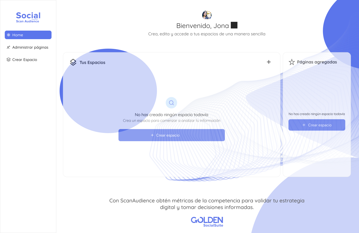
Two new sections were added to the home screen, so users can have direct access to options they didn't have before.
Functionality: The home screen went from being a screen without functionality to a screen with quick access to the platform's features.
Direct access to spaces: Now users can see their spaces on the home screen and can access them directly.
Direct access to add pages: Users can view/add pages quickly.
Add Pages
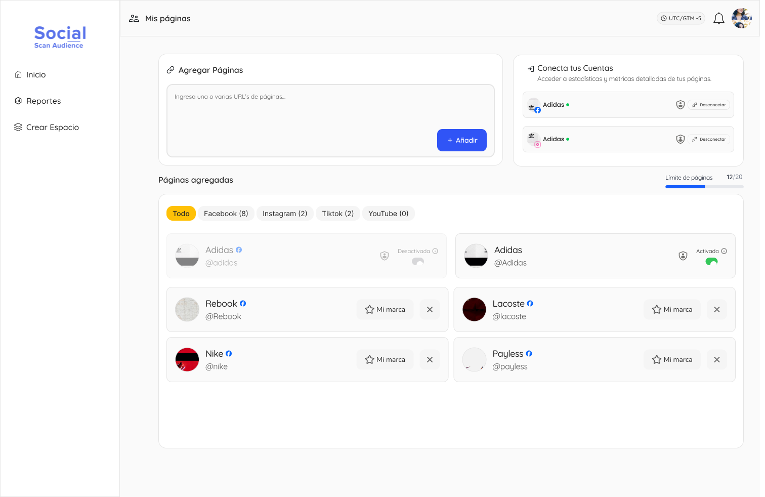
The add pages screen was redesigned, improving usability and user experience.
Add pages input: The add pages input was given more prominence so users can find it more easily.
Added Pages: Users can now view their added pages in a clearer and more organized way.
Help: Visual aids, hints, tooltips, and descriptions were added to help users better understand each section.
Space Creation
Creating spaces was a process that required several steps and wasn't very clear to users. First, users had to add pages, then in a separate process create a space by selecting which pages they wanted to monitor.
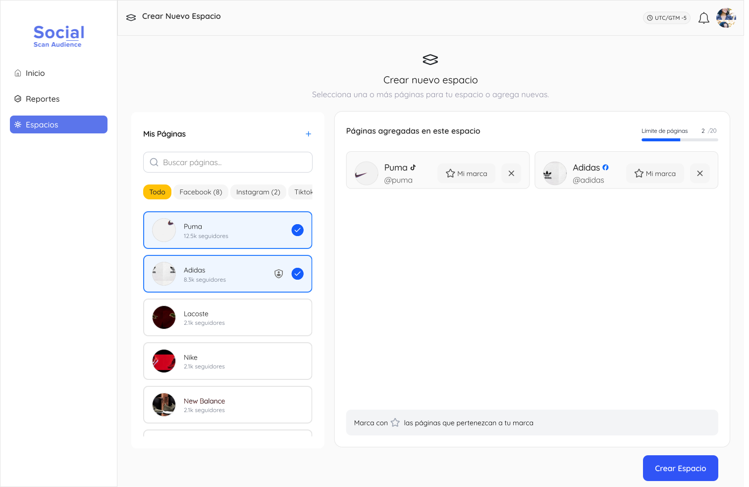
Space Creation
Now they can create a space and add pages in a single process, making the flow simpler and clearer for users.
Add Pages: Users can now add and select pages while creating the space, making the flow simpler and clearer.
Selected Pages: Clearly visualize which pages have been selected for the space.
Usability: The usability of the space creation form was improved, helping users better understand each section.
Dashboard/Comparison
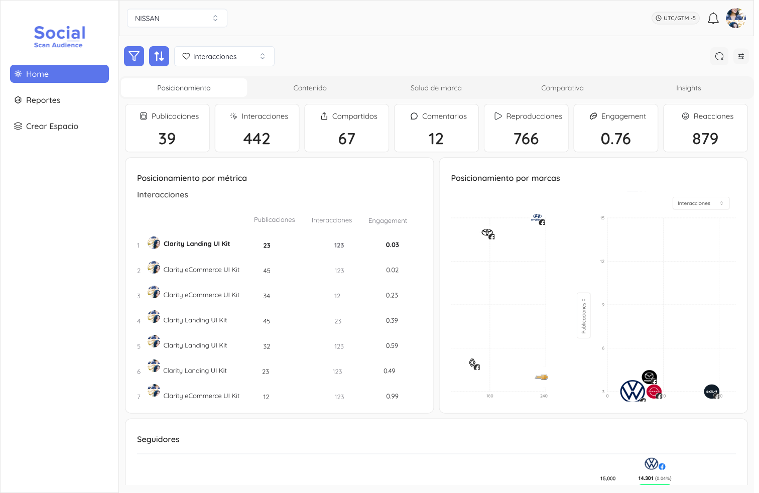
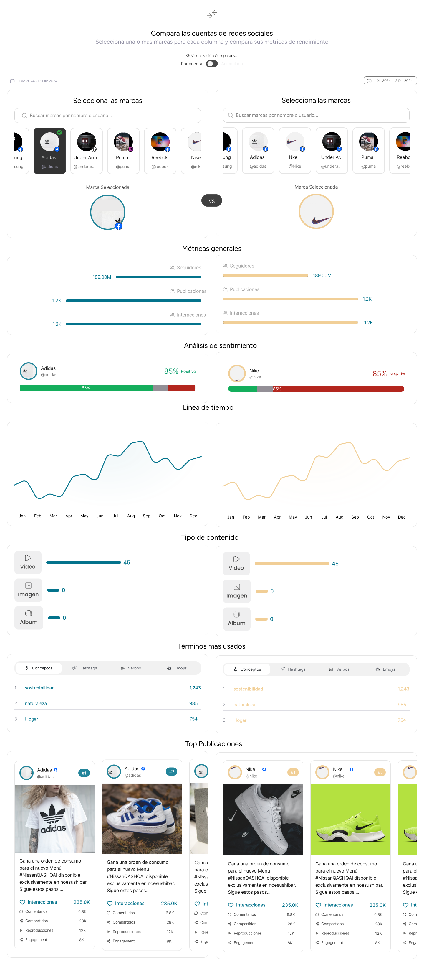
Dashboard/Comparison
The dashboard and comparison view were redesigned, standardizing information, improving the information hierarchy, and maintaining a consistent experience.
Information Hierarchy: The information hierarchy was improved, helping users better understand each section.
Fewer Tabs: The number of tabs was reduced, helping users better understand each section.
Improved Comparison: The comparison feature was improved, allowing users to compare themselves with other users more clearly and efficiently.
Results and Impact
- Improved initial understanding of the platform
- Reduced time it takes users to identify key actions
- Consistent visual hierarchy
- Positive feedback from internal users and stakeholders
Learnings
Organized flow makes the difference:Maintaining a clear order with visual hierarchy and a clean UI improves the first impression and platform adoption.
Apply key heuristics: Validation and application of heuristics can be the starting point to improve and standardize design. They can be key when designing to know how we want to communicate our designs.
Information hierarchy: Information hierarchy is key for users to better understand each section. Keeping colors, icons, sizes, typography, etc. consistent helps communicate information clearly and efficiently.
More projects